Hypocampus 2016 – the past year – part II

Hypocampus is a site for Medical students built on Cortexio.

Throughout the development of Hypocampus, we have tried to work closely with our users, students and editors.

We have had the privilege of having users who are really committed to what we do and want Hypocampus to be a success.

The Surgery Course – August 2016

When the surgery course started at the end of August, we were given the opportunity to present Hypocampus at the intro lecture to a large part of the class. During the course, we have had contact with many of the course who have come up with suggestions, corrections and participated in deeper interviews. This information has formed the basis for how we have chosen to prioritize new functionality.

Read the post about our cooperation with Gothenburg Univeristy

User feedback – September 2016

Here are some of the reactions we got after the first few weeks of using Hypocampus:

  • Make it possible to record and take notes in the text
  • Insert chapters into a reading schedule
  • Spaced repetition visualized on a timeline
  • Mark chapters as read
  • Difficult to understand how to navigate
  • Past exams

Better sense of progress – Sept / Oct 2016

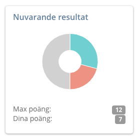
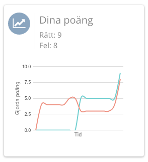
A big feature that we worked with throughout the fall is to try to improve the sense of progress: What have I read, how well can I do, what do I have left?

Read more about the updates to the user statistics

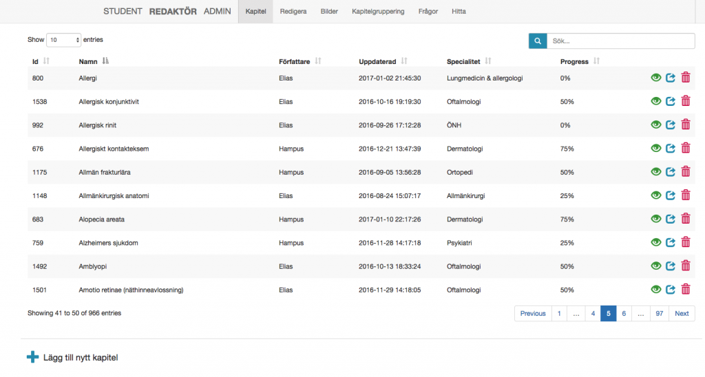
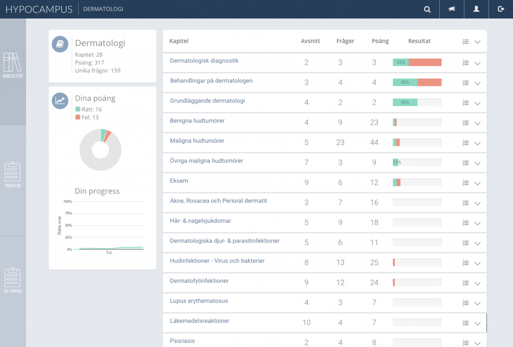
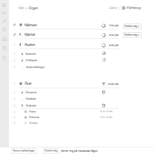
We have worked in several places to try to improve this, but one of the clearest parts is the work on the chapter list and the statistics that appear there. In previous blog posts you can see how the chapter list has evolved over time.
Read a summary of events 2016

Visualizing progress also helps to motivate further studies.

Exams and AT-test – Nov / Dec 2016

After getting approved to use AT tests and a number of exams from different universities, we developed our own question section for AT and exams.

Read more about our Exam functionality

This was something that was right on time before Christmas, before the exams in January, it was very popular to answer questions in Hypocampus, not least with the new Exams part.

Specialist reviewed material – Nov / Dec 2016

During the autumn we consulted specialists to review our material in several courses. On the dermatology course we have got a collaboration with Sam Polesie from the Skin Clinic at Sahlgrenska University Hospital to add and improve text and questions. This is something we are working on, but it takes time!
Hypocampus 2016 – the past year

Hypocampus is a site for Medical students built on Cortexio.

In https://blog.cortexio.se/2017/01/13/hypocampus-the-start/ we wrote about how the project started and described the methodology for how we came up with what was to be built in our first beta version. Here we continue to write about what the development looked like and a bit more around the company.

Hypocampus grows – April / May 2016

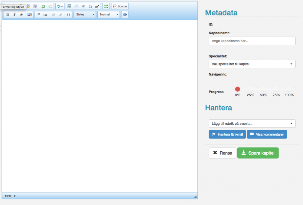
In addition to fixing basic parts such as database, server hosting, certificates, logins etc, there were two important parts we needed to get in place: Editing tools for material and navigation among the material.

At first glance, text editing may seem like a simple problem to solve; we’ve been doing it on computers for decades. But we also want to be able to categorize the material into chapters and courses, be able to link words and headings in chapters and be able to add pictures and videos.

To solve these problems we have built our text editor around  ckeditor . We also have our own tools for determining which chapters are included in a course, managing links and images.

Dermatology – May 2016

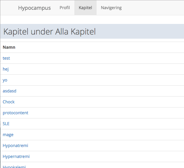
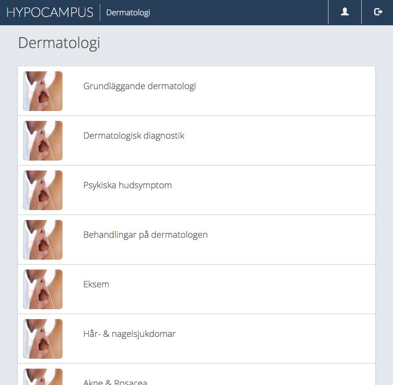
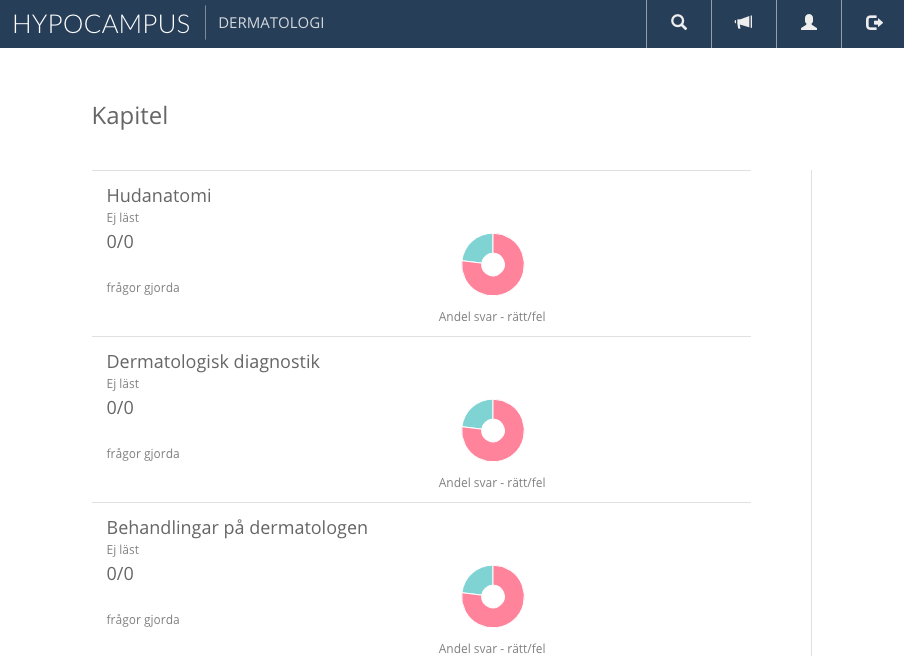
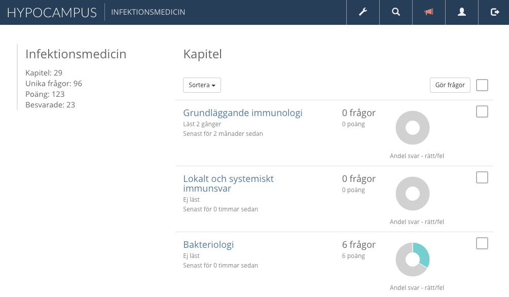
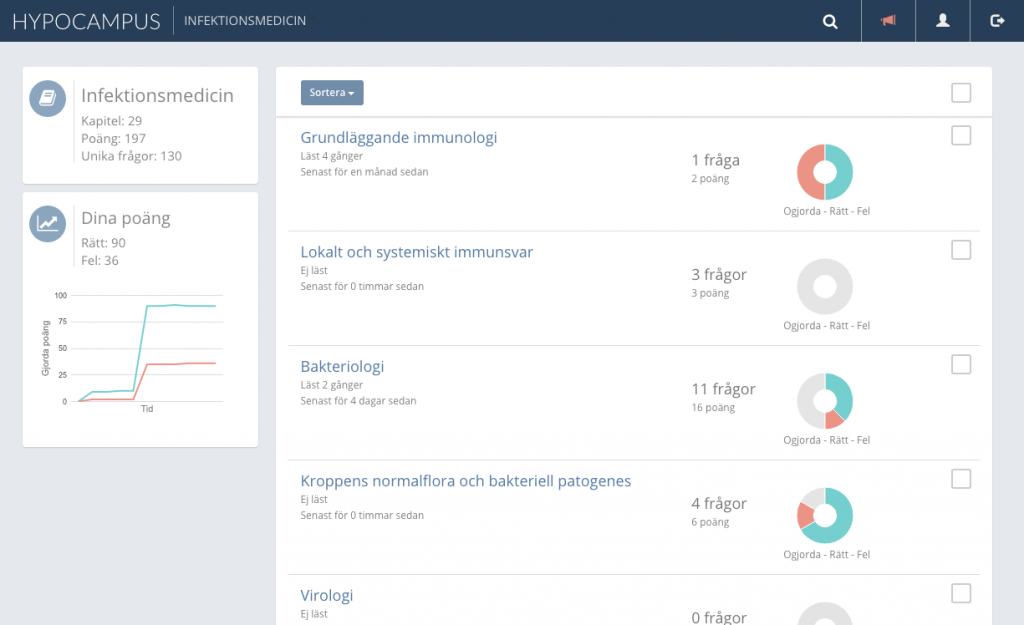
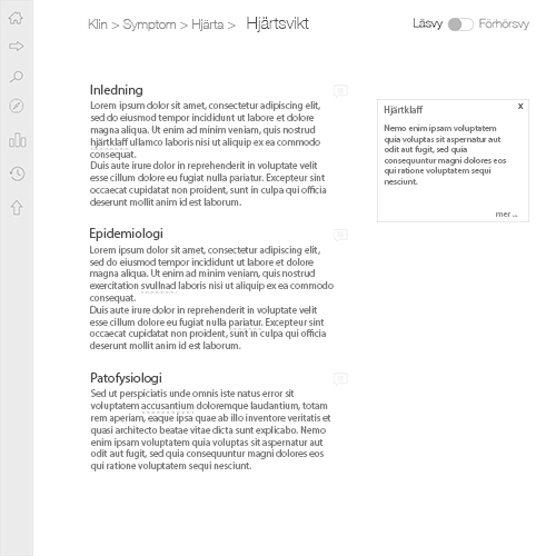
Our first goal was to be ready with the Dermatology course for the re-examination in August 2016. For this course we had good material to start from and contact with specialists who were willing to review. Below is a collage of what the presentation of chapters looked like during the year.

Version 1 and 2:

Version 3 and 4:


Version 5 and 6:

Links in the material & better navigation – June 2016

A major improvement in navigation came in June when we added the opportunity to create links between chapters in the material. It works as a reverse wikipedia link. The Link Target is set where the description of the word is located. When the Link target is highlighted, the system goes through all other chapters to try to find the word or synonyms for the word and create links to the Link Target from there. In this way, the editors do not have to manually try to create all the links, which saves a lot of time.

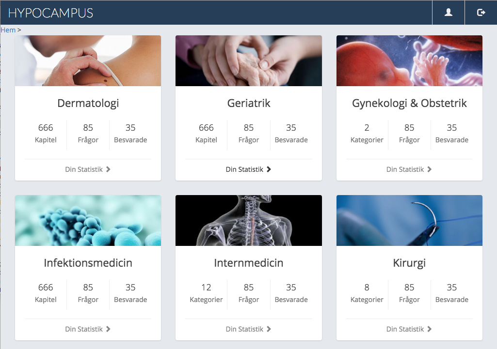
In early June, even the classic category cards were in place, which have lived with ever since:

The Surgery Course – June 2016

In June 2016, we got in touch with course managers for the Surgery course at Sahlgrenska. They were developing a question application and we started a collaboration to test the Hypocampus on the surgery course in the fall of 2016. At that time we had only mulitple choice questions in the system, but in the surgery course, and many other courses, MEQ (modified essay questions) is a central part. In MEQ questions, the student is guided through a patient case and must make a decision based on the information at hand.

Question section, surgery course – July / August 2016

So we needed to implement support for MEQ questions, submit questions and materials for the surgery course before the start of the course, 22/8.

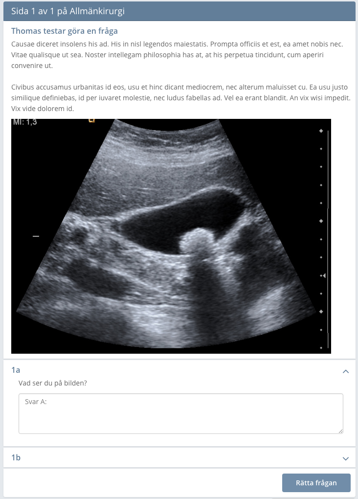
The process of making MEQ questions possible was more complicated than we first thought. The MEQ questions must be in order, it is not possible to see the description of the next question as it may contain the answer, but it must be possible to see the previous description etc. When we looked at example questions and exams it was not consistently divided: Some questions were divided into several levels: 1.2 A, B, C, 1.3 A, B, C where there was the same case and description for everything under item 1, while other questions had fewer levels. And how would we do with text answers? Trying to auto-correct?

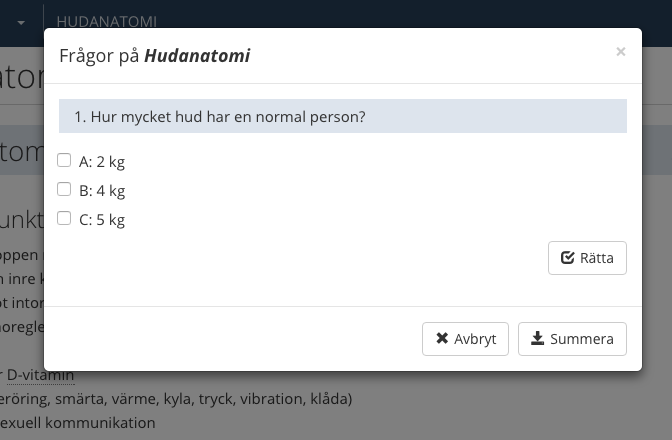
After going through at least three different variants of MEQ questions, we felt satisfied, one week before the start of the surgery course.

Version 1 – MCQ only:

Version 2 – text response:

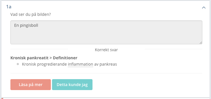
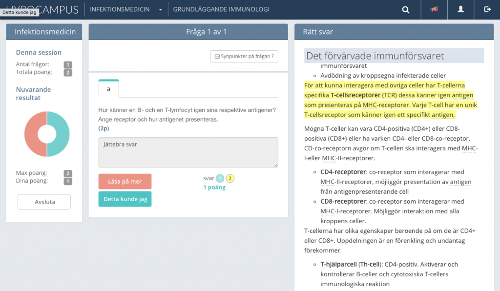
Version 3 – the correct answer is shown on the right:

In the last version we also got text markings to show more precisely where in the text the answer is.

That’s all for this post, more to come!

Hypocampus – the start

Hypocampus is a site for Medical students built on Cortexio.

Thanks to everyone who helped make 2016 a really good year for Hypocampus! Here is some info on the first months of Hypocampus history.

We started the trip in April 2016 when we decided to jointly develop a study portal for the medical program – something that was both lacking and in demand. Getting help to structure the studies to learn as effectively as possible was our goal with the service.

The 5 founders; Per-Ola, Elias, Daniel, Hampus and Thomas, started the project by collecting data about our users (medical students) to understand how we could build the best service for them. We did user studies in the form of forms, emails and longer interviews. From the data we collected we built a Persona.

Persona canvas – Student

Facts
Ambitious
Lack of money
Pains
Books are expensive
Examination anxiety
Behavior
Buy or copy books
Studies more than they need
Goal
Pass the exam
Become a good doctor

The Persona is quite simple, but based on it we justify decisions about the service from a user perspective. We also produced a problem statement: “Anxiety due to poor control over their learning process”. This helped us to define our main features in the next step.

Main features

“Anxiety due to poor control over their learning process”

 Main Feature Knowledge level feedback
 Sub Feature 1 Streamlined learning
 Sub Feature 2 Organizing learning materials

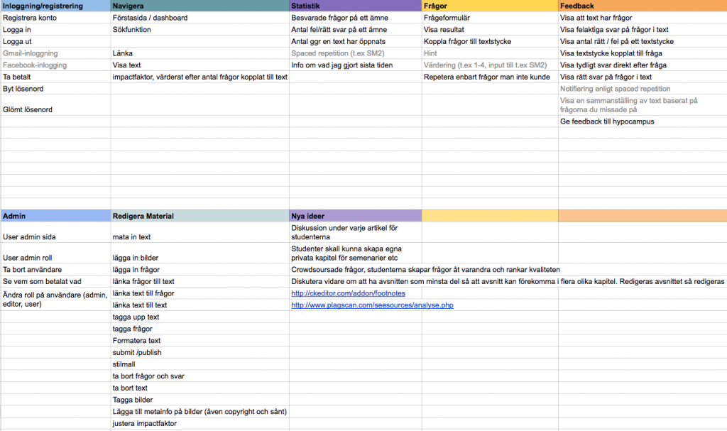
After agreeing on our main features, we did a brainstorm to come up with functionality for each feature. The following is a breakdown of the different functions we looked forward to for each main feature.

Main Feature:Sub Feature 1:Sub Feature 2:
Knowledge level feedbackStreamline learningNavigate in learning material
See progress (read blocks, number of times, time), questions, read informationAnswering questions according to Spaced repetition (ANKI?)Avoid redundancy
Weighted educational info on a variety of questions linked to the informationNotification to users according to spaced repetitiontagging system (organ, specialty, symptom)
Markers in text (correct, incorrect, undone, included in exam questions)Met today’s goals, set your own goalsNavigation tree
View statistics (Group level, class, friends etc), over time (history)Tools for questions / tipssearchable
Gamification, creating motivation, eg scoring system, “pat on the shoulder”…Make your own and share questionsClarity in navigation
manual assessment with regard to writing questionsContest, quizlinks to sufficient information
User listing on materials (difficulty, interest, uninteresting etc?)opportunity for time-honored learningIndex
Tools for questions / tipsQuestions linked to a defined amount of textClarify structure through colors
Exam mode (timer, no cheat)Write questionsImagemap
The editor can announce the difficulty of informationMCQ (one and several correct answers)Go to weighted material to get the best possible hits

We have now implemented some of the functions mentioned above, others that are still in the plan for the future.

Since it is easy to come up with fun features, but there is limited time, we went ahead by selecting the features we thought we needed to be implemented before we could let users in.

Minimum Viable Product (MVP)

In order for a product to be as good as possible, it must be adapted to the needs and response of the users. The best way to get user feedback is to have users, so you want to get your product out as quickly as possible. We therefore created a list of features we need to get ready before we can let users in – our very first beta version.

User Stories

Once we defined the functions we wanted to include in our MVP, we specified each function in more detail to understand what needed in the service to fulfill the function. Here we work with something called User Stories and which gives a clear picture of how different actors interact with each other: Student, System, Author.

NamePrioIdUserDescriptionActionPostconditionExceptional case
Navigate
View chapters via navigation1StudentAs a student, I want to be able to find a chapterThe student chooses to navigate to a chapterThe system shows the selected chapter
Follow links2StudentAs a student, I want to be able to follow links1. The student chooses to display a text containing a link.The system displays the target text.The link is not in the system, the text to which the link is edited, the text is deleted
2. The student clicks on the link.The system displays the text that the link points to.

After we agreed and specified our User Stories, we were ready to move on to sketching how this could be resolved systemically.

Mockups

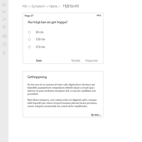
A problem can often be solved in many different ways, especially when it comes to the computer world and interactive services. Where should buttons, text, images be and what should they look like? To quickly go through many different ideas in a short time, it is a good way to sketch with paper and pen. It is easy to see if you have missed something in their User Stories: “But you have to navigate back from the chapter to the course view!”, “Here it would be good if you could start a question session”, “Here I want to see statistics on how many chapters there are ”. This is a very inexpensive way to make sure everything is connected. Once programmed, any change suddenly becomes much more expensive.

From mockups, the step to prototype is not far. If you are unsure of a feature’s design, it can be a good way to let users test a simple prototype before moving on to the more time-consuming implementation step.

That was all for part 1 about Hypocampus 2016. There will be more in part 2.